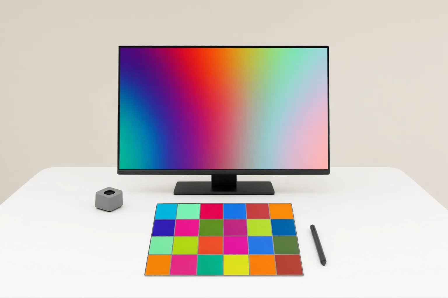
Use sRGB when broad, predictable compatibility is the priority. Consider Display P3 when its wider range of saturated colors matters and the entire viewing workflow reliably supports color management. For many web projects, a practical approach is to edit in a wider space when useful and export a separate, correctly profiled sRGB copy for delivery.
Display P3 vs sRGB at a Glance
Display P3 has a wider color gamut than sRGB, with much of its additional range in saturated reds and greens. Its blue primary is similar to sRGB’s. That extra range can preserve colors that fall outside sRGB, but viewers will benefit only when the relevant software and display workflow interpret the color space correctly.
sRGB, developed by HP and Microsoft and finalized in 1996, was designed to improve consistency across devices and the web. It remains the broadly compatible baseline for web images and standard SDR content.
Display P3 should not be confused with theater-oriented DCI-P3. Display P3 uses a D65 white point and the sRGB transfer curve; DCI-P3 is configured for different viewing conditions. See W3C’s color-space definition and MDN’s gamut guidance.
Choose Based on Where the Image Will Be Viewed
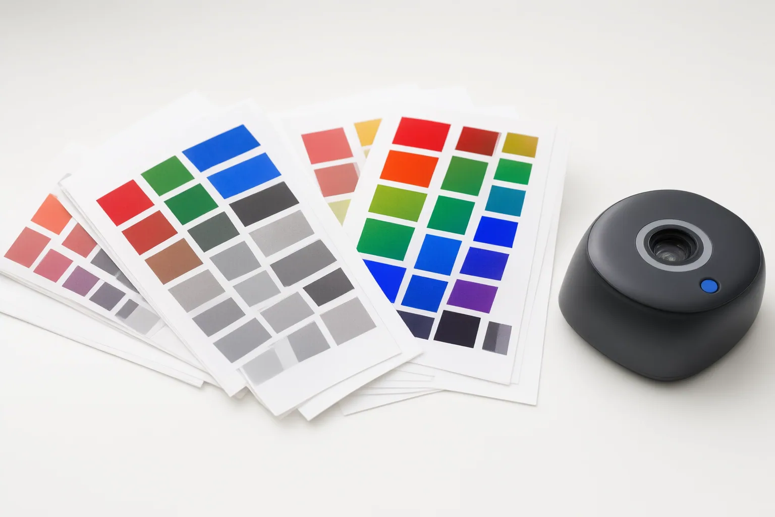
Choose sRGB when an image must remain predictable across a broad mix of websites, applications, and displays. Choose Display P3 when its extra saturated reds and greens are useful and the intended environment reliably supports wide-gamut, color-managed output.
A wide-gamut image depends on both software and the display workflow for correct interpretation. In an unmanaged or mismatched environment, colors can be clipped, desaturated, shifted, or rendered with unintended saturation. CSS Color Level 4 supports Display P3 colors; the cited source reports support beginning with Safari 10.1 and Chrome 111, but browser capability alone does not guarantee that every stage of a viewer’s workflow will reproduce the wider gamut as intended.
Do not treat a monitor’s advertised gamut coverage as proof of color accuracy. Coverage describes how much of a target color space the monitor can reproduce; it does not establish accurate out-of-box rendering.

A Practical Editing and Export Workflow
A compatibility-oriented workflow can preserve a wider working space during editing when the image benefits from it, while producing a separate sRGB copy for general web delivery.
- Select a working color space that fits the editing task and intended output. A wider space may retain colors beyond sRGB when those colors are present and useful.
- Keep the working file separate from delivery copies so an sRGB export does not replace the wider-gamut version.
- For general web use, convert the delivery copy to sRGB rather than merely assigning a different profile label.
- Export with the correct color profile embedded when the workflow supports it.
- Inspect the exported file in representative browsers, applications, and displays used by the intended audience.
These steps address a common failure mode: an image looks vivid while being edited but becomes dull or color-shifted after upload because its profile was missing, stripped, ignored, or interpreted as another space. An unmanaged application on a wide-gamut monitor can also make sRGB-authored content appear oversaturated. Reducing a monitor’s saturation control is not a substitute for proper color-space conversion and management.
Conclusion
Use sRGB when broad compatibility and predictable web delivery matter most. Consider Display P3 when the additional saturated colors serve the image and the editing, export, software, and display chain can manage the wider gamut correctly.
For a flexible workflow, retain a wider working version when useful and create a converted, correctly profiled sRGB copy for general delivery. Before publishing, check that exported copy in the browsers, applications, and displays your audience is likely to use.
Disclosures and limitations
- This article was prepared with AI assistance. Its core color-space definitions were checked against W3C CSS Color 4 and MDN documentation; application-specific behavior may vary.
- No hands-on application or display testing was performed, and no affiliate recommendations are included.
Sources
- Color Profiles Explained: sRGB vs Adobe RGB vs Display P3 — Stop Your Exports Looking Wrong — DEV Community
- Color Management for Web Images: sRGB vs Display P3 Explained | U-Ultra/Unity Blog — iamuu.com
- sRGB vs Display P3: Wide Gamut Color Explained — ColorFYI — ColorFYI
- Convarso – Free Online Tools — Convarso
- DCI-P3 – Wikipedia — en.wikipedia.org
- Color Profiles Explained: sRGB vs Adobe RGB vs Display P3 — ConvToSomething – Free Image Converter
- What Is a Color Space, and Why Do sRGB and DCI-P3 Cover Different Colors on Monitors? — KTC
Improve this guide
Report a problem or suggest the next question
Submissions enter a private editorial queue. They are reviewed and deduplicated before any public update or new page is created.